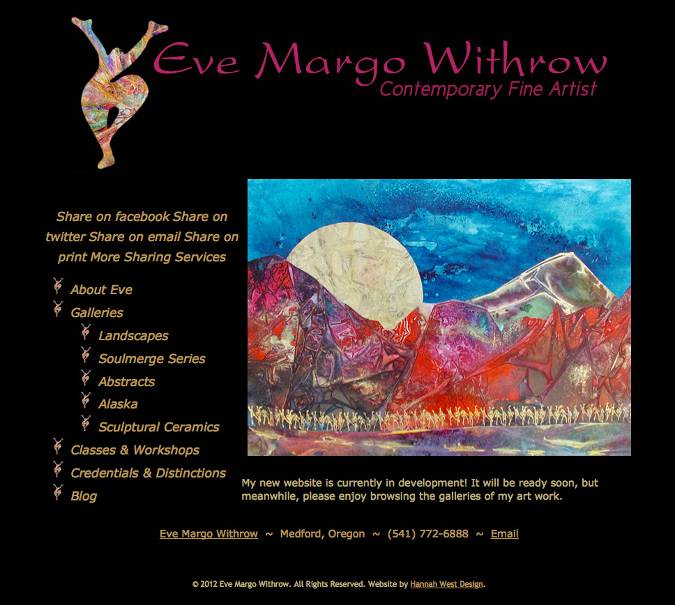
Having had a very busy 2012, I got to Eve’s new website later than I had anticipated. By the time my schedule was clear to begin, she was in a time crunch, with three art shows coming up in late May-early June and the promotional materials for an artist studio tour already out – with her website published in them, of course! She wanted to be able to manage the site herself, but we were in a hurry to get a great splash page up that would conceal the work we were doing on the WordPress installation that would become her actual website while providing a look at her art. Our solution was based on the design I had created for artist Silvia Trujillo in late 2011, with a dark background and links to galleries of her work which would start a Lightbox slideshow when clicked. Here’s a look at the very handsome splash page:
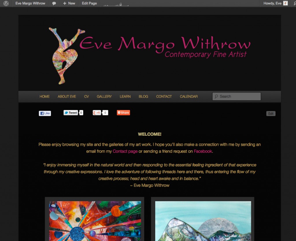
Eve wanted her WordPress installation to be mostly used as a content management system she could use to update the site herself, but did want a simple blogging tool where she would publish announcements of art shows and festivals, classes & workshops, new works and musings. She also wanted a calendar she could easily manage which would show potential clients and students what her schedule looked like and when new classes would take place. Since she already had a Google account, a Google calendar was the logical solution. Though she loved the drama of a couple of custom themes I ran by her, she liked the look of the default WordPress theme, 2011, using the dark style. I customized her logo for use in the site’s header image and we created custom menus, but didn’t really need to heavily customize the blog itself, saving time for the creation of the galleries of her substantial catalog of artwork. Here’s a look at how her new home page came out:
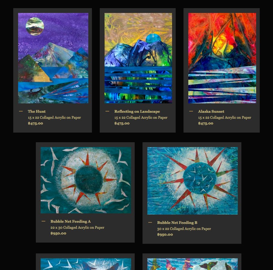
With as much art as we had to put on display, a good deal of my time went into finalizing her images and formatting the gallery pages. Fortunately her images were in good shape, requiring only a little adjusting to eliminate edges and make sure the color saturation was is line with the original art. We made the thumbnails a fairly generous size so visitors could get a decent look at them, and made an enlargement of each image available with a simple click with a Lightbox script.
Here’s a partial look at one of her art gallery pages:
Finally, we added AddThis sharing tools to make sharing easy for visitors to her site and updated her Facebook professional artist page (and so she could see sharing analytics in her free AddThis account), which hadn’t been customized to take advantage of the new Timeline, syndicating her blog to the page and her personal profile with the fabulous Networked Blogs app, as well as Google Analytics and Feedburner email subscription capability. Feedburner incidentally is a great way to make subscribing by email possible, as it provides analytics for your feed and subscribers in the free Feedburner account one creates when setting it up. Once we were finished with all the details, she wrote a beautiful blog post to introduce her new blog. The next day was Mother’s Day, and we unveiled it in the morning. Once complete, unveiling is a simple matter of deleting the splash page and your new site is online! Submitting the site to the search engines is the final step, and then, being good to go, using all the newly connected social networking features to promote it!
Working with Eve was a joy – she was so organized and professional, working hard to get her images to me in the best condition possible and encouraging me all along the way. It’s so wonderful when clients become friends, and this has happened with each site I’ve completed this year. Please visit EveMargoWithrow.com to view the amazingly creative and beautiful work she has on display there and to learn about the creativity classes and workshops she teaches! make a connection with her by email or Facebook – you’ll be glad you did!


