In late 2013, my dear friend and artist Kris Baxter, sent me a referral—Joan Pechanec of Mt Shasta, California, who needed a new artist website on a tight budget. The website is built on the WordPress platform, using a theme which wound up needing lots of custom modifications so the resulting site design would suit her aesthetics. As Joan and her husband, author Charlie Price, were on their way out of town for a 3 month writer’s residency at Fairhope on the Gulf Coast of Alabama, it was perfect that they were both able to come up and meet me in person before they left. We had discussed her website needs on the phone and reviewed them to make sure I knew her priorities, purchased her domain name joanpechanec.com, and sent them off on their adventure.
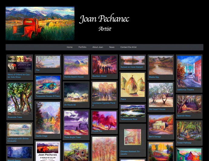
 Joan wanted visitors to her website to be able to see all of her works on her home page, so we chose a theme that’s designed with the masonry technique (like Pinterest), yet with a dark background that really makes the highly saturated colors in her paintings pop. PinPress is an interesting theme since it provides a Pinterest-style presentation on the home page, with each “pin” leading to a page with an enlargement of the image and information about the painting—perfect for an artist. Joan has artworks in two categories on her site – assemblage/collage pieces and more recent oil paintings. To compensate for a quirk in the theme, we needed to do some modifications in order to separate the categories onto their own pages, with all the categories showing on her home page. Therefore, I created a “child theme” to preserve these modifications when the “parent” theme, PinPress, is updated.
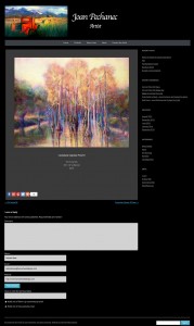
PinPress does not have a lightbox presentation for enlarged images built in, and while I love WordPress, the way it handles the display of full-size images is less than ideal, opening them in a new page so a visitor has to touch the back button on their browser to return to the page they were looking at. To improve this behavior, we installed FancyBox, which provides a similar type of image enlargement behavior as many are familiar with on Facebook. My own website also has FancyBox installed—click the image to the right, which shows the design of the individual painting pages on Pechanec’s website, to see what I mean.
The PinPress theme is fully responsive, so it is mobile-friendly and looks great on any mobile device. Check it out on yours and let me know what you think!
Working with Joan by remote (a good bit of it while they were on the road to their destination) went smoothly and I’m delighted that both she and her husband were pleased with the results. Joan had a budget and a target completion date in mind, and even with a fairly substantial collection of art images which needed editing and copyright and contact metadata added, we finished under budget and on time!
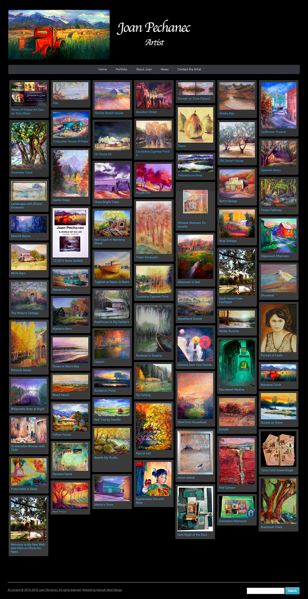
Below is a screenshot of Joan Pechanec’s entire homepage. It loads incrementally as a visitor scrolls down the page, but this shows all the content (as of February 2016) fully loaded, You can click this one to see a larger image:
Since its initial publication, joanpechanec.com has had major updates. In January 2014, the curator for the Orland Art Center found her website by chance and loved her work so much that she contacted Joan to invite her for a solo show the following year. She was so excited to let me know that her website had brought this amazing opportunity to her! She worked hard for a year, completed unfinished paintings and creating new ones, until she had a collection of 45 paintings to show. Then we updated her website with the new paintings and more information, as well as an announcement of her exhibition. The results were fantastic, and you can read more about it on her website. I hope you will visit joanpechanec.com and have a look!
It’s always so nice when a client provides a helpful testimonial when their project has been completed. Here are the kind words Joan wrote to me:
“I am so pleased with the website Hannah West created for me! Her artistic sensibility and her talent for color and design brought a unique and dynamic quality to the site. And, a huge bonus for me, a computer novice and technophobe, Hannah was incredibly patient and informative, especially given the different colors and structure I kept requesting. I would recommend Hannah highly for any web design work, but particularly for artists and visually oriented businesses! She is a true artist.”
~Joan Pechanec


