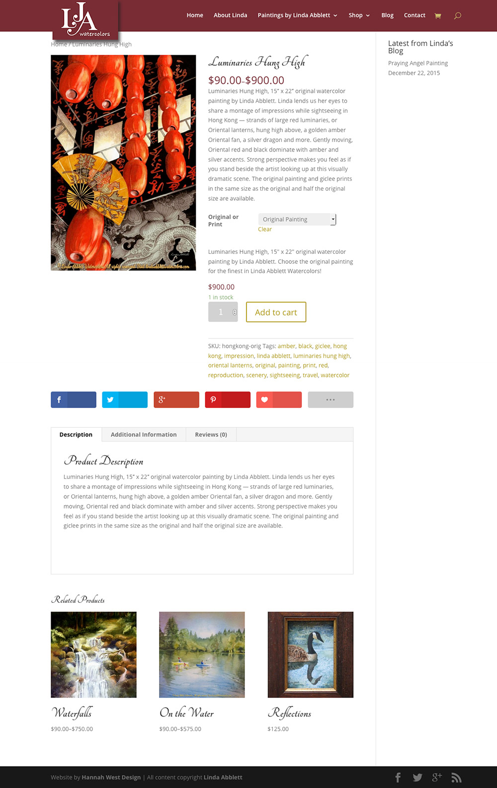
Linda and I met when she became a member of the Art Presence Art Center, where I serve on the Board. We had gotten together around that time for a consultation on her existing website, lindaabblettwatercolors.com, which had been created by a close friend using GoDaddy’s Website Builder. The site was pretty (due to her lovely watercolors), however her images did not have any metadata not visible copyrights, and the site was not responsive, and therefore not mobile-friendly. It did not have an effective way to share to social media, and the shop section had basic PayPal buttons. Serviceable, but not ideal.
A year or so later, she and her husband came to see me again. Don told me that he wanted Linda to have a means of marketing her paintings and upcoming art classes that would serve her long after he was gone. It was so sweet to see how concerned he was about his lady’s future! We decided on a custom website with an ecommerce shop built with WooCommerce for her original paintings and prints, complemented by a Mailchimp newsletter account and Pinterest site. She liked the sites I’ve made using the Divi theme, and when I assured her that her website would be as individual as the others she had seen, she decided that was what she wanted. We upgraded her hosting at GoDaddy to their new Managed WordPress hosting, which was offered at a very reasonable introductory rate.
As with the redesign of any existing website, 301 redirects were necessary to preserve the SEO value that lindaabblettwatercolors.com had accrued during its lifetime. When there are many pages on a website, this can take time, but it’s very important! Never skimp on the redirects, or you will find your SEO/page ranking goes down and people following older links to your site will find a 404 Not Found page instead of your beautifully redesigned website.
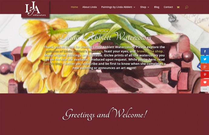
As the final touch on her new website, Linda created a beautiful logo from her initials, which I tidied up and placed in the top navigation bar. It really makes the site hers, with her own personal touch. As with other Divi sites I have made, this logo hangs below the menu bar on page load, with a drop shadow to add depth to the page’s appearance, and “retracts” into the menu bar as a visitor scrolls down the page.
lindaabblettwatercolors.com Home Page

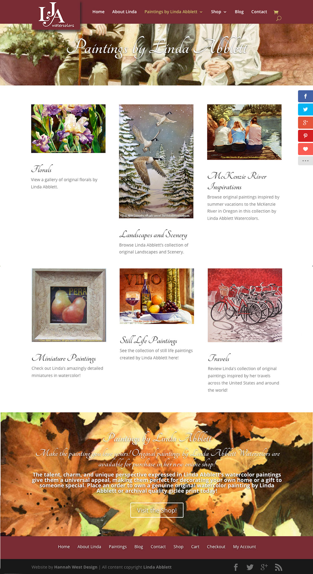
Portfolio Gallery Landing Page
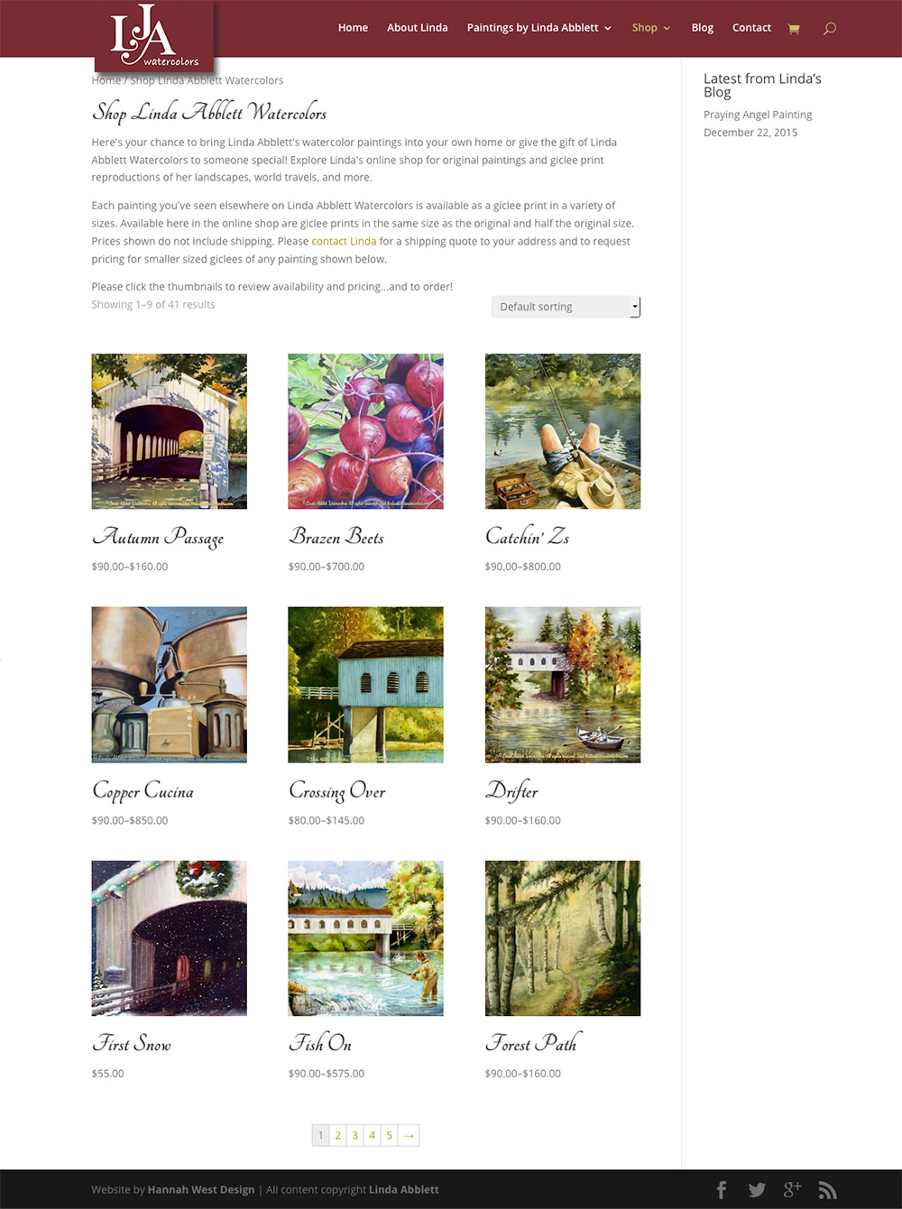
E-Commerce Online Shop
Writing Services
Linda had hoped to do the writing for lindaabblettwatercolors.com herself, but found she was so busy as the holidays approached that she never could quite settle her mind down enough to concentrate. As writing is one of my specialties, I told her not to worry and did the writing for her. Naturally this does add time and therefore expense to a project, but the results can be very worthwhile. I found that my search engine optimization on this site was the best I had done to date, and my writing had a lot to do with the results. If you are an artist who does not feel writing is one of the items in your basket of talents, or if you are otherwise in need of professional writing for your website and/or other marketing and promotion materials, please consider letting me do the writing for you.
Writing captions for paintings in an image gallery is one thing, and writing the text for their product pages is quite another. I winged it on most of Linda’s, and in the end she had very little she wanted to add, change or correct from my original copy. You may find some of the intro text at the top is duplicated in the product description further down the page. This ensures the search engines have the 300 words per page—with key words and phrases repeated a couple of times—that they need to rank the page well and to include it in search results appropriately…without making such a large block of text that no human visitor wants to read it at all! If you find that the text I write seems redundant, that’s why—the search engines want to see the main keyword for the page repeated in the page’s url, the page title, at least one primary heading, and a few times in the text. I do my best not to let it seem contrived, but if I am not provided with much text it can be a challenge. If your paintings or other items of interest have a story of any kind, or details that might be of interest to a buyer that there’s no way I could know, please make sure I have something I can work from so it is included. This makes each item even more unique, stimulates interest in the reader, and helps to satisfy the needs of the search engines without seeming so repetitive. I realize it’s a lot of work! But the more you can provide me with, the less it will cost, and the results will be much more effective.

