ruchhardware.com retail website
Completed 5-2016
In 2016 Tiffany Ryan came back after we completed tifstradingpost.com at the end of 2015. Her next project was a ruchhardware.com retail website to promote her long-established brick-and-mortar store in the beautiful Applegate Valley of southern Oregon. Tiffany wanted to have the website completed in time to launch in conjunction with the store’s 15th anniversary celebration. This website was intended to provide information about new products and events, and to make it easy for busy customers to view the site or contact her from mobile devices while on the go.
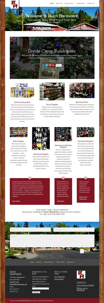
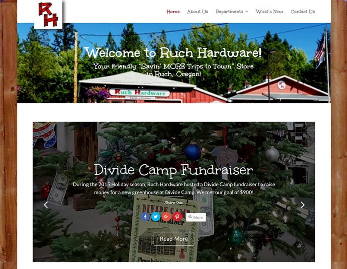
The home page of the ruchhardware.com retail website has a slider which dynamically updates with the latest blog posts. This was one of the main features Tiffany was looking for. On a desktop it has the popular parallax effect. Her home page also features blurbs with images to lead visitors to other parts of the site for more information, customer testimonials, schema markup using the Yoast Local SEO premium plugin for best display of key information in search results, linked phone number and a contact form. These page elements adjust to display beautifully on any mobile device. We went for a friendly design with casual, country-style heading fonts:
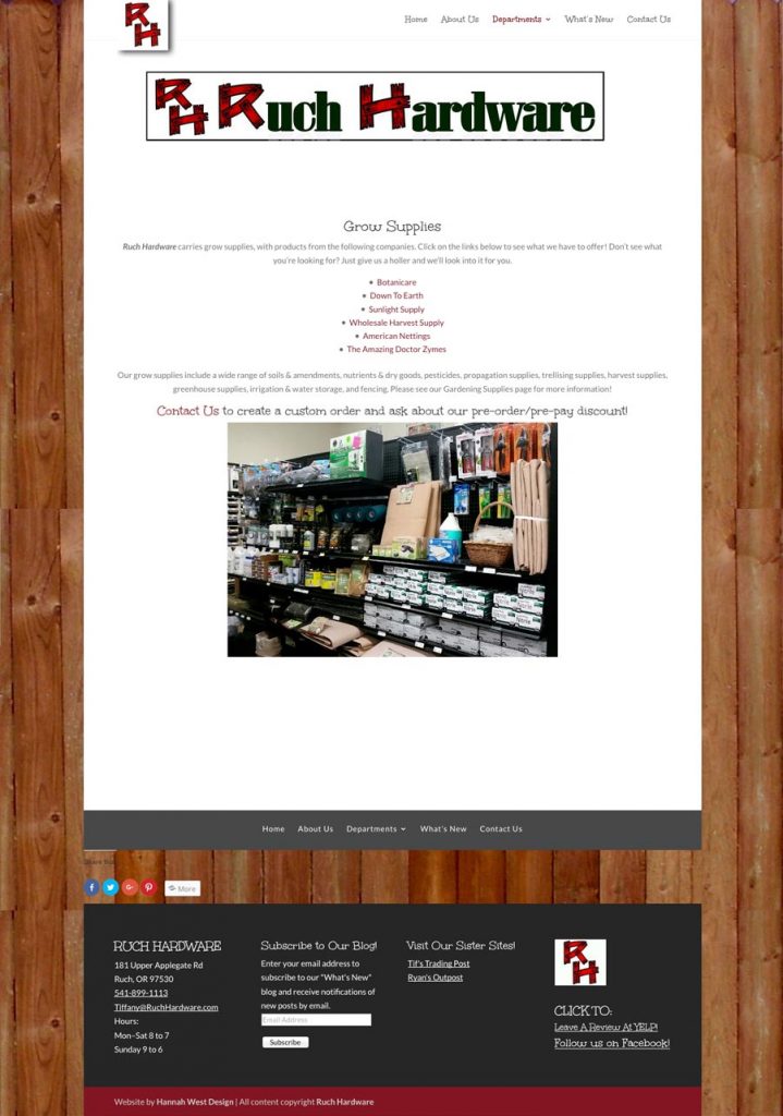
In the Departments section, we added a page for each of the primary categories of products Ruch Hardware stocks in the Ruch, Oregon store. Some have a gallery of images that give visitors a glimpse of the items on Ruch Hardware’s shelves. Others have a single image like the one below:
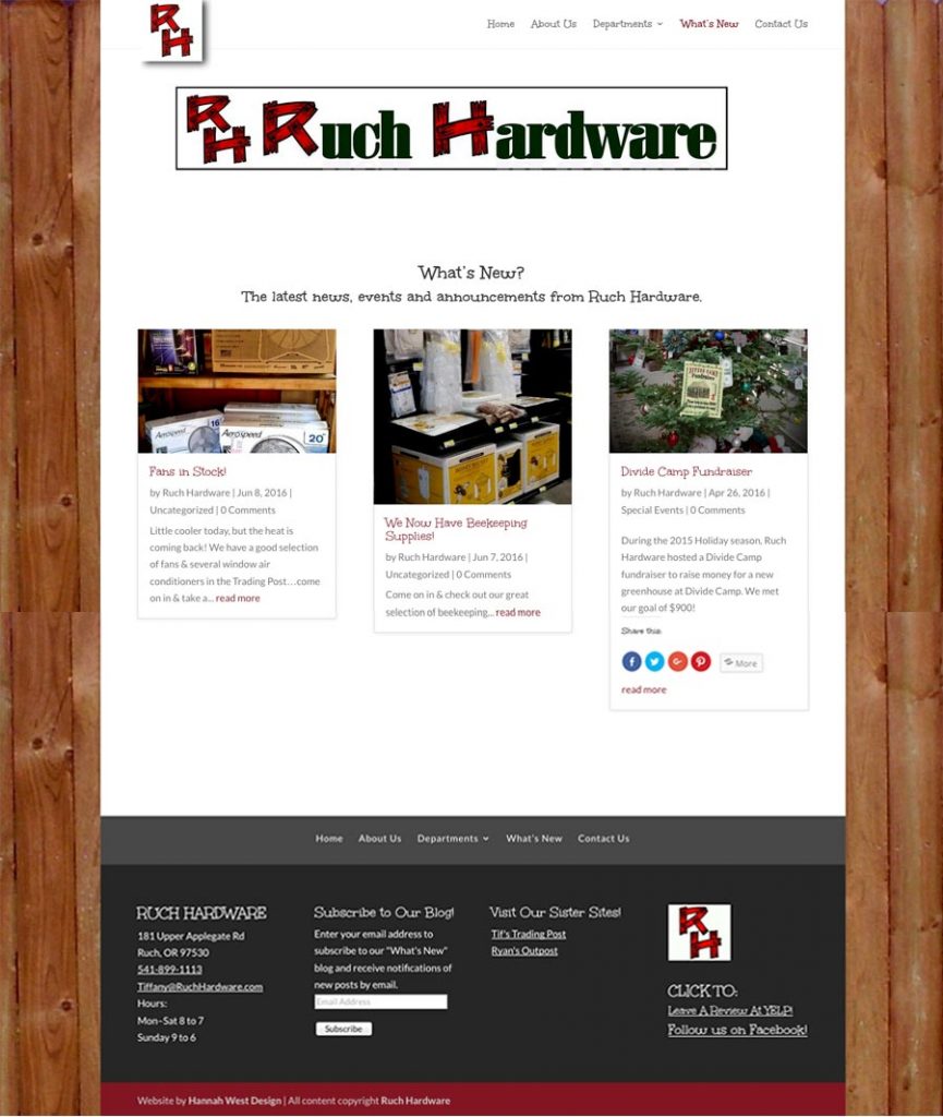
Here is the blog page that feeds the ruchhardware.com retails website home page slider. Tiffany chose to name her blog “What’s New?” It displays post excerpts and featured images in a “masonry” style similar to Pinterest:
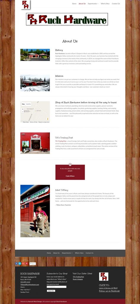
The ruchhardware.com retail website has a special About Us page. It includes a brief history of the store, mission statement, map and call to action, promo for Tif’s Trading Post, a testimonial, and a statement from Tiffany. We will add brief bios for her staff in the weeks to come.
The ruchhardware.com retail website also has a special Contact page. It includes a shot of the Applegate Valley, Google map, linked phone number and email links for key staff, and a contact form.
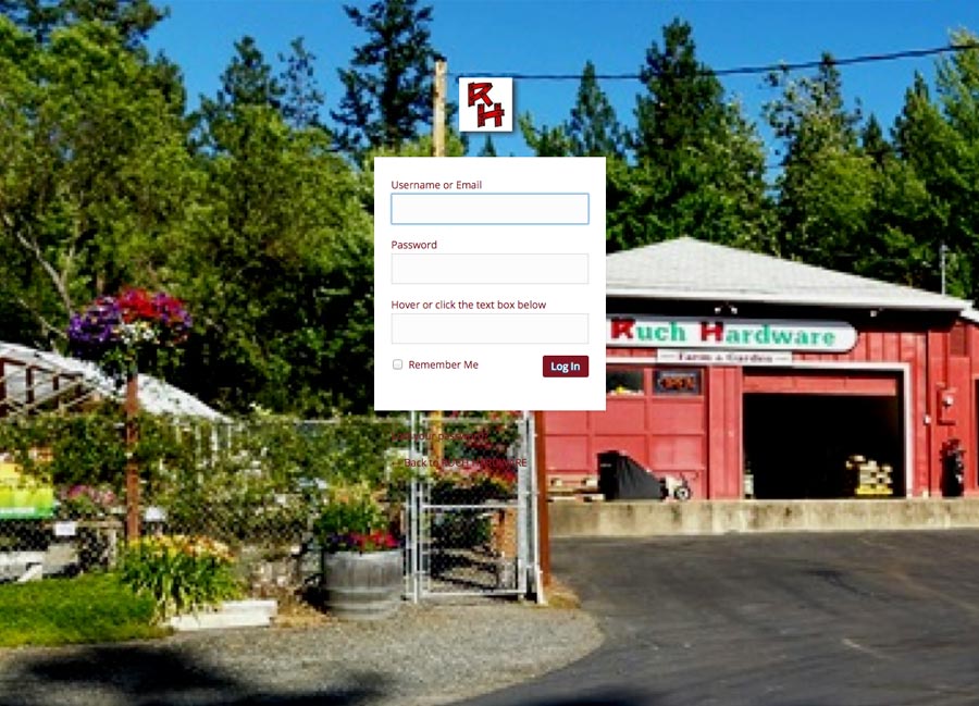
Last but not least, the ruchhardware.com retail website got a branded login page. I anticipated that both Tiffany and her employees will be logging in to the site, and that this could occur in situations where a customer is nearby. It only made sense that it should be more attractive than the default and reinforce Tiffany’s Ruch Hardware brand with her logo and a picture of the storefront. She didn’t have an image quite large enough to display perfectly, but we will replace it with another one in our next update:
I hope you have enjoyed reviewing the details and elements that went into this cheerful neighborhood store’s website! If you have a shop you’d like to promote online in a similar manner, please contact me to discuss your needs.

