One of the things I like about my work is that I’m often asked to update or create a new website for an artist who has just moved into my area. It’s a great way to make new friends and keep a finger on the pulse of the arts. Creating a new website for Michael Carpenter in March/April 2015 was one of those “welcoming committee” assignments. Michael Carpenter and his lovely wife lived in Portland for much of Michael’s professional career as a successful graphic designer. They have spent a good deal of time in California and New Mexico since he retired and began devoting his time to the fine art oil painting that fired his passion for art as a young man. They moved here recently, and decided it was time for Michael to establish a presence online. Many thanks to artist and plein air painter Norm Rossignol for referring Michael to me!
Michael is not an emerging artist. His experience, skill and diligent study as well as a very refined eye are evident in all his work, so building a new website for him was a real treat for an artist and art enthusiast like me. I prepared a total of 77 images for this project, 36 images of original oil paintings for the website and the rest, images of paintings that are now only available as prints for Michael’s promotional use. That was a LOT of eye candy to soften the technical end of the work for me! And it felt good to be protecting them with the addition of internal metadata and a visible copyright/website address to each image. A little cropping and adjusting to the images themselves was required, though not too much as they were in very good shape when they came to me. A total of about 15 minutes per image on average to make them fully web-worthy and ready to add.
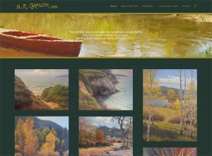
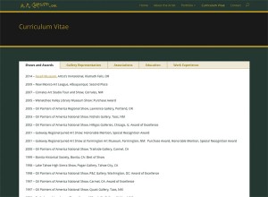
On the technical end, Michael’s site was built with a complete suite of plugins chosen for various back end functionalities, including a complete security setup, search engine optimization, Google analytics, and caching for consistent performance and page loading speed. More too, but surely that is boring to most readers. What’s not boring at all are the three portfolio galleries of his paintings, displaying his work in Still Life, Landscapes and Waterscapes categories. His home page displays a few images from each category to give you an idea of what you will find as you continue to explore the site. These image galleries are presented in the new “masonry” style, which I’m very grateful for as it shows each image in its entirety—no unpredictable cropping that deprives visitors of a glance at each painting in its fullness before clicking to view and enlargement. A bio page to learn more about the artist, a customized CV page which includes his shows, distinctions and awards, and a contact page round out the presentation on Michael Carpenter’s new website.
Michael’s site received a fair amount of attention when it came to customizing the theme. By default a white background and very modular, the newer Divi theme by Elegant Themes is becoming very popular with my clients for its very nice portfolio layouts. These don’t come with the theme by default, but are available in a separate download if you look hard enough for it. Divi is also a responsive theme, so Michael would emerge on the internet ready for Mobilegeddon with a theme that looks fabulous on both desktop and mobile devices. Michael chose a deep green background with black banner areas and gold text, adding custom gold accents to the theme itself as well. What a great call! The site looks very elegant and refined, and quite masculine without being “strong.” An effective, subtle and understated setting for his wonderful paintings. We “lifted” his signature from a painting and turned it into a site logo and customized a number of additional elements throughout the theme.
Even the parallax site banner, which opens the site with an accompanying quote from the artist, got a lot of scrutiny and adjustments before it was just right. We had to make some compromises on this important detail due to the difference in how its displays on mobile and desktop browsers. No one really likes making that kind of compromise, but when we were finished Michael was satisfied that it looked the best it could across the range of device sizes. In the end our collaboration resulted in a beautiful new website for Michael Carpenter that we are both proud to present. Where’s the champagne?!
New website, new friends…without any further adieu, here’s a glimpse of Michael’s new website home page, and a few features that people interested in a new website might like to see. You can click therse for a larger image, but please take a little bit of time to visit the live site at www.michaelcarpenterart.com, enjoy all his paintings, and inspect the various features of the website. Who knows, you might find a painting you can’t live without! If you’re an artist, particularly if you paint en plein air, you will find much of interest in his work to be inspired by. Thanks so much for entrusting me with this project, Michael!


