new website

Testimonial from Jannie Ledard

I am humbled and very grateful to have received this lovely testimonial from Jannie Ledard.
I have recently asked Hannah to update and redesign my website. I was indecisive about choosing a style that would speak to me. Hannah made it very easy. She patiently explained the different approaches. Being an artist herself, she knew how to choose the perfect words to express my vision. When I posted my new website on FB, I received endless written and oral compliments!
I highly recommend Hannah for her artistic taste and great professionalism!

It was a joy creating a new website for Jannie’s beautiful glass art. I hope you will take a moment to visit it and see her work and mine: https://www.jannieledardglassart.com/

New Website for Veronica Thomas

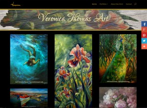
Veronica was introduced to me by Boni de Laire, whose website I reconstructed in June 2014 and have maintained since then. Originally from South Africa, Veronica has lived in the States for the past 15 years. Since moving to Oregon she has been realizing her dream of becoming an artist, focusing on oil painting. When the opportunity to attend an exclusive painting workshop in Scottsdale, Arizona, arose, Veronica started looking for ways to earn some extra money to cover her travel expenses, and friends agreed to host an art salon at their home in mid-April. Mentor Boni insisted that a new website for Veronica Thomas was a must at this critical juncture, and that it be completed by the time the art salon took place so she would have an online promotional tool to work with. That’s where I entered the picture.


When the three of us sat down to discuss the project, I showed them the last site I had completed, www.michaelcarpenterart.com. Veronica liked it so much she went straight for a similar design using the same theme, Divi, by Elegant Themes. As with all my other clients, Veronica’s site was equipped with a full suite of plugins for search engine optimization, page loading speed, social sharing, and of course security to protect the website and its visitors.


One of the fun things we incorporated was a Google font with a special effect, accomplished with a css styling trick. Veronica wanted the headings to match the branding on the invitation mailers, flyers, and business cards that her daughter Chloe had developed for her. It wasn’t available as a Google font, but they wree able to find one that was so similar one can hardly tell it’s not the same. The other challenge was that Veronica wanted the header with the effect on the home page, but without the effect on all the other pages. Not only was I able to pull this off successfully, but the research and the execution went very quickly, so it wasn’t a spendy experiment either. I love how my clients push me to learn new things with their challenges! Another arrow in my quiver…


The one sticky part of the Divi theme seems to be the banner space. It’s a bit unpredictable how much of an image will appear in this space in a desktop browser, yet the entire image will show in a mobile browser.  I can do quite a bit of customizing, but it’s still tricky. Chloe is proficient with image editing and social media, so she was a huge help in this regard. In the end, our collaboration again resulted in a new website for Veronica Thomas in which we all take a considerable amount of pride. It was completed and launched well before her deadline, Veronica sold enough paintings at her art salon to help cover her expenses during the workshop in Scottsdale, and she is now busily absorbing all the new information she possibly can in Arizona! We will be doing the first update on her site once she returns to indicate which paintings have been sold. Meanwhile, here are screenshots of Veronica’s new website as launched on April 17, 2015. You can click these to view larger versions, and there is a link to the live website in the paragraph below.


veronicathomasart.com, new website for artist Veronica Thomas created and launched in April 2015 by Hannah West using a customized version of the Divi theme.
Website created for artist Veronica Thomas in April 2015 by Hannah West.
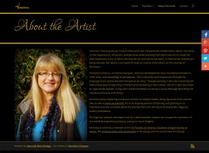
Screenshot of Veronica's Bio page, showing the difference in the heading style from the Home page
Screenshot of Veronica’s Bio page, showing the difference in the heading style


Please visit Veronica’s website and help it gain momentum with viewers online and the search engines. Her artwork is beautiful and, from children to wildlife and still life to plein air landscapes, she paints such a wide variety of subjects that it took eight portfolio categories to accommodate them all! Her site is another beautiful example of how the Divi theme can be customized for various purposes. If you would like to see examples of how I have used and customized Divi in other projects, click the links in the sidebar for fashion jewelry designer www.wendygell.com (including e-commerce shop), portfolio galleries of landscapes in oil at www.michaelcarpenterart.com, soft and lovely watercolor portfolios at www.judybuswell.com, presentations for harp strings and related products and information at markwoodstrings.com and the spectacular Mountain Glen Harps website, with one of the most amazing home pages I’ve made to date. This last one is a great way to see what’s possible with Divi.


If you like Divi’s flexibililty but would like to see an alternative, I have used a similar, and very popular, premium theme called Avada which I purchased at Theme Forest to create www.jacksonvillechiropracticclinic.com (very professional and takes advantage of numerous shortcodes in the design), and the gorgeous nonprofit ecommerce site www.missioncandles.com, probably the most beautiful site I’ve created yet. I enjoy working with both of these themes and though there are many themes out there I’d love to play with, I do hope to use the truly premium quality Avada again in the near future.


Friends take care of friends and extend the family. I’m so happy to have gotten to know Veronica and look forward to an ever-deepening friendship with her. Many grateful thanks to my dear friend and talented artist Boni dé Laire for referring Veronica to me! Please visit Boni’s website to see her amazing landscapes in oil. You will not be disappointed, they are truly spectacular and we will be adding a new painting soon!


New website for Michael Carpenter

One of the things I like about my work is that I’m often asked to update or create a new website for an artist who has just moved into my area. It’s a great way to make new friends and keep a finger on the pulse of the arts. Creating a new website for Michael Carpenter in March/April 2015 was one of those “welcoming committee” assignments. Michael Carpenter and his lovely wife lived in Portland for much of Michael’s professional career as a successful graphic designer. They have spent a good deal of time in California and New Mexico since he retired and began devoting his time to the fine art oil painting that fired his passion for art as a young man. They moved here recently, and decided it was time for Michael to establish a presence online. Many thanks to artist and plein air painter Norm Rossignol for referring Michael to me!


Michael is not an emerging artist. His experience, skill and diligent study as well as a very refined eye are evident in all his work, so building a new website for him was a real treat for an artist and art enthusiast like me. I prepared a total of 77 images for this project, 36 images of original oil paintings for the website and the rest, images of paintings that are now only available as prints for Michael’s promotional use. That was a LOT of eye candy to soften the technical end of the work for me! And it felt good to be protecting them with the addition of internal metadata and a visible copyright/website address to each image. A little cropping and adjusting to the images themselves was required, though not too much as they were in very good shape when they came to me. A total of about 15 minutes per image on average to make them fully web-worthy and ready to add.


On the technical end, Michael’s site was built with a complete suite of plugins chosen for various back end functionalities, including a complete security setup, search engine optimization, Google analytics, and caching for consistent performance and page loading speed. More too, but surely that is boring to most readers. What’s not boring at all are the three portfolio galleries of his paintings, displaying his work in Still Life, Landscapes and Waterscapes categories. His home page displays a few images from each category to give you an idea of what you will find as you continue to explore the site. These image galleries are presented in the new “masonry” style, which I’m very grateful for as it shows each image in its entirety—no unpredictable cropping that deprives visitors of a glance at each painting in its fullness before clicking to view and enlargement. A bio page to learn more about the artist, a customized CV page which includes his shows, distinctions and awards, and a contact page round out the presentation on Michael Carpenter’s new website.


Michael’s site received a fair amount of attention when it came to customizing the theme. By default a white background and very modular, the newer Divi theme by Elegant Themes is becoming very popular with my clients for its very nice portfolio layouts. These don’t come with the theme by default, but are available in a separate download if you look hard enough for it. Divi is also a responsive theme, so Michael would emerge on the internet ready for Mobilegeddon with a theme that looks fabulous on both desktop and mobile devices. Michael chose a deep green background with black banner areas and gold text, adding custom gold accents to the theme itself as well. What a great call! The site looks very elegant and refined, and quite masculine without being “strong.” An effective, subtle and understated setting for his wonderful paintings. We “lifted” his signature from a painting and turned it into a site logo and customized a number of additional elements throughout the theme.


Even the parallax site banner, which opens the site with an accompanying quote from the artist, got a lot of scrutiny and adjustments before it was just right. We had to make some compromises on this important detail due to the difference in how its displays on mobile and desktop browsers. No one really likes making that kind of compromise, but when we were finished Michael was satisfied that it looked the best it could across the range of device sizes. In the end our collaboration resulted in a beautiful new website for Michael Carpenter that we are both proud to present. Where’s the champagne?!


New website, new friends…without any further adieu, here’s a glimpse of Michael’s new website home page, and a few features that people interested in a new website might like to see. You can click therse for a larger image, but please take a little bit of time to visit the live site at www.michaelcarpenterart.com, enjoy all his paintings, and inspect the various features of the website. Who knows, you might find a painting you can’t live without! If you’re an artist, particularly if you paint en plein air, you will find much of interest in his work to be inspired by. Thanks so much for entrusting me with this project, Michael!

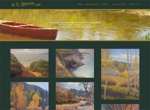
Screenshot of www.michaelcarpenterart.com homepage, created by Hannah West Design in April 2015
Screenshot of www.michaelcarpenterart.com homepage, launched April 2015
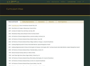
Curriculum Vitae page. www.michaelcarpenterart.com
Curriculum Vitae page, www.michaelcarpenterart.com


New Website Launch! WendyGell.com

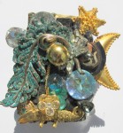
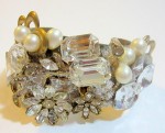
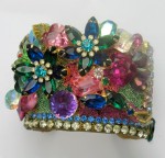
I am delighted to announce a new website launch for renowned fashion jewelry designer Wendy Gell at wendygell.com!

Wendy’s previous website was beautiful, but the infrastructure needed updating and she wanted a fresh new look that was unpretentious, yet highlighted her past accomplishments, with modern ecommerce features that would enable her to sell her incredibly sparkling and beautiful fashion jewelry designs. We began by streamlining her email newsletter and creating temporary pages with several new pieces of jewelry not previously seen on her website. Then, behind the scenes, we created a new site on the WordPress platform, using the flexible and responsive Divi theme by Elegant Themes so it would display nicely on mobile devices. Then we added a WooCommerce shopping cart with PayPal as the primary payment gateway. Optimized the site and products using the highly respected SEO for WordPress plugin by Yoast and added BulletProof Security to protect her investment in the site and to protect her visitors from malware. Once all the products were added to the shop and everything was ready to go, we migrated the development site to its permanent home at wendygell.com.

What we wound up with is a beautiful site that highlights Wendy’s fashion, bridal, and holiday jewelry designs (along with some gorgeous tiaras for princesses big and little!) as well as her fabulous Gelastic Art, with a beautiful shop that displays subcategories nicely with the modestly priced Nested Categories extension by WooThemes. She made a sale almost immediately! We also included features that will help her continue to grow her following, with social follow and sharing tools by AddThis and a newsletter signup form.

We invite you to visit Wendy’s site and feast your eyes on glittering pop art fashion jewelry to your heart’s desire! Wendy plans to continue adding to her new online shop, so there will be new jewelry items and artwork to see on a regular basis, and there is much to learn about this talented designer whose jewelry has appeared on the Oprah show, been worn & collected by household name movie, television and pop art culture celebrities – even royalty! – and featured in fashion magazines around the world for decades. I am so honored to be working with this amazing woman and her enduring talent, and equally proud of her new website. See how beautifully we can display the items you want to offer for sale online and contact us to discuss what we can do to help you accomplish your own online business objectives.

New Website Completed for Judy Marshall!

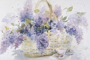
"Lilacs", one of Judy's most popular paintings. ©Judy Buswell. All Rights Reserved.
“Lilacs”, one of Judy’s most popular paintings. ©Judy Buswell. All Rights Reserved.

I am delighted to announce a new website completed for Judy Marshall, who paints in watercolor under the name Judy Buswell. Her former site needed a complete revamp, and we converted it to WordPress so she and her husband can manage it themselves. Judy’s work is so lovely, the majority of her pieces being delicate watercolors of flowers and gardens, and it was a joy to work with the images while creating her new site. Why wait to read my writing? Visit www.judybuswell.com today! You can always come back to see what I have to say after feasting your eyes on her watercolor paintings.

Judy offers greeting cards and prints of her paintings, as well as some original paintings on her website, with a simple purchasing strategy – email the artist to order. I think this is wonderful as it requires personal contact between artist and art lover, something many artists don’t realize is an exciting part of buying art for those who love it. There is a contact form on each of the pages with items you can purchase, and the images are large and…gorgeous…particularly those of her more recent paintings. Visit www.judybuswell.com and order some of her pretty Christmas cards today!

Today Judy came to my office for a coaching session on blogging. She will be posting new works on her new blog, and posting about her daily artistic activities when she goes to visit family for a few months next year. I think this is an exciting development, as Judy loves to write almost as much as she loves to paint, and her followers and those discovering her for the first time will be able to learn more about her passion for painting and see works in progress. She wasn’t hugely confident in her ability to do this, but I found her to be a quick study and was not at all surprised when she called me a couple of hours later to tell me she had already been playing with the text in a couple of posts. She sent me some very kind words later…

“Thank you, Hannah. You are a very good teacher, and an even better web designer.”

Among the back end features of Judy’s new art website are search engine optimization, Google Analytics and WordPress site stats, security, backup and restore functionality, social sharing, and copyright protection via Digiprove. I always set up Webmaster tools with Google and Bing after finishing a website, submitting sitemaps generated by the SEO plugin, a highly respected piece of work by Yoast. On the front end is a magnificent presentation of Judy’s artwork with a beautiful premium WordPress theme, specially formatted pages with special galleries to showcase her artwork, a blog, and a visible copyright protection notice in the footer from Digiprove. The sentimental quality of Judy’s paintings does the rest better than I could…

Thanks to the attentiveness of Judy and her husband, this only took a month to complete, even with a number of other projects requiring my attention at the same time and they taking a couple of trips out of the area. Thank you so much for entrusting the renewed online presentation of your paintings to me, Judy!

MissionCandles.com Online Shop is Open!

Rainbow Cheerlites® candles are a Mission Candles exclusive!

Just in time for the holidays, we have finalized the shopping cart and the missioncandles.com Online Shop is open and ready for your holiday candle orders!

Many heartfelt thanks to Laura O’Bryon, Executive Director of Community Works, the nonprofit parent organization of Mission Candles and the Lithia Springs Program of which Mission Candles is a part, Jim Posey, Director of Education and Residential Treatment Services, and Jason Fauble, the Mission Candles Production Coordinator, for entrusting me with the renewal of the Mission Candles website and online shop.

I can’t say enough about how much I believe in this program. The testimonials of youth who have graduated the program tell the story of how effective it is at helping Ashland, Oregon youth who have experienced debilitating problems of one kind or another and educating them, providing work experience and other essential services, teaching appropriate and effective relationship skills, and turning out young men and women who are ready to become valuable members of the community. The Mission Candles component of the program is financially self-sustaining and a crucial part of the healing, empowering experience that the Lithia Springs Program provides.

I am equally excited about the candles that Mission Candles produces! They make 9″ tapers in a variety of colors to match just about any décor scheme and an exclusive rainbow taper for a lively look. Perfect for candelabra, menorah, wall sconces, candlesticks, and more. Gorgeous. Then there are the Cheerlites®. These “birthday” candles take the cake! These come in 3″ and 8″ lengths (have you ever heard of 8″ cake candles? Their existence was news to me…), in a wide variety of colors to suit any occasion (including Mission Candles’ exclusive rainbow, and metallic gold and silver!), and can be used for holiday centerpieces and other décor applications beyond the kitchen. Not only do they come in a dizzying array of beautiful colors, but you can also opt for one of four different glitter finishes (something I had not seen before and fell in love with) – multicolor glitter, gold or silver glitter, and opal glitter – a subtle and beautiful accent that adds extra sparkle to the table and the eyes of those around it. I am enticed by the thought of delicately sky blue candles with opal glitter to send our daughters for their sons and grandsons’ birthdays, red candles with gold glitter for my mom, elegant metallic gold candles for decorating, and who can live without the royal touch of purple somewhere in their home? The prices are reasonable for such lovely and versatile options, and to celebrate their website’s launch they are offering FREE SHIPPING from now through January 1! I’ll be ordering some myself, and you should too!

Please visit missioncandles.com today and support this important social program with a purchase of candles…for birthdays, holiday decorating, gifts and stocking stuffers. Your friends and family will love them, and you will want them in your own home all year ’round!

MissionCandles.com Online Shop is Open!


New Website for Lori Garfield!

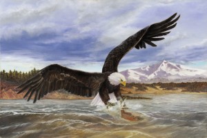
Eagle Fisher, Original oil painting of a bald eagle catching a fish by Lori Garfield
Eagle Fisher, Original oil painting by Lori Garfield

Great news! I just got a call from artist Lori Garfield with her approval of the new website I created for her. A couple of small adjustments and she’s ready to fly!

Lori was fantastic to work with, organized and on top of any requests for additional material or other input I sent her way. For that reason her site came together very quickly, completed in two weeks from the day we set her up with a new hosting service (she had free hosting at WordPress.com before, but we wanted to expand the possibilities beyond what they permit on their site) until the final tweaks that marked its completion today.

We built her new site on the WordPress platform using a very nice responsive theme I just discovered, called Fifteen, with a few customizations and using Jetpack mosaic-style galleries to display her art. I love that masonry look, it’s a great way to display a portfolio of artwork that varies in shape and size. Implementing the SEO by Yoast plugin, security plugins, and sharing capabilities put the final touches on her website that make it search engine and human visitor friendly.

Lori is a wonderful animal artist, creating her pet portraits, wildlife paintings and more in oil on canvas. She is a giver, and a portion of all her art sales goes to various animal non profits, so any purchase you make from her, whether an original oil painting, an archival quality giclee print, or a commission for a portrait of your pet, you will also benefit the nonprofit animal organizations she supports.

Lori is not limited to animals as an artist, and you will find some gorgeous landscapes and human portraits in the galleries of her paintings. Please visit Lori’s new website to view her lovely artwork, and consider leaving a comment with feedback on her paintings and her new website, sharing her site on your favorite social network, and giving a gift of art to someone special who loves animals this holiday season for a double blessing! www.lorigarfield.com

New Website for Jacksonville Chiropractic!

Jacksonville Chiropractic Clinic, Dr. Jason Williams,  Jacksonville, OregonI would like to thank Jacqueline Williams for entrusting me with the ground-up redesign of the website for Jacksonville Chiropractic Clinic, featuring Jacque’s husband, chiropractor Dr. Jason Williams, and the licensed massage therapists who practice alongside him!

Jacque was lovely to work with, and when she had to step aside for a couple of weeks for unrelated reasons, I felt I had enough information from our very productive first meeting to forge ahead on my own. When she returned, she was delighted to find the site ready for her review. We made a few adjustments, I did some housekeeping on the technical end, notified the search engines that the site had been revamped, and it was ready to go! Afterward, she said to me “Thank you so much, Hannah. I’m not very good about delegating, it’s just so much more efficient to do things myself most of the time. But I was really impressed with what you were able to accomplish without any input or participation from me while I was away. I thought it was going to be much more work on my part, but you made it so easy and painless! The site is beautiful, functional and easy to navigate, and I can’t wait to share it with our patients and the community!”

I am particularly proud of how this website came out in the end, and feel the layout and design is flexible enough to use for a number of different types of business. It even looks great on mobile devices!

We were careful to observe the new search engine optimization (SEO) techniques and hope it will be favored by the search engines as a result. You can help by leaving a comment on the blog post announcing the new site, by searching for Jville Chiropractic on Google or Bing and clicking through to the website, then lingering there or browsing the site for a little while, or by sharing the site with your favorite social network. 8.24.14 UPDATE: One of the things we did to boost Jacksonville Chiropractic’s SEO rating was to invest in a paid plugin by Yoast called Local SEO. Previously when we searched for “Jacksonville Chiropractic,” we saw mostly sites in Jacksonville, Florida in the search results. Now, and in record time, Jacksonville Chiropractic’s Oregon site dominates page one of the search results! Alternative searches have it either as #1 in the page one list, or lower on the page, but still on page 1. Even a search for “jason williams dc“, which predictably pulls up results with Jason Williamses from many walks of life, has OUR Jason Williams’ bio page at position #6, and the link to jacksonvillechiropracticclinic.com in position #7! Your help in lickcing the links you found in the search results made a huge difference in the amount of time this usually takes, too…Thank you!!

Please visit the site and take a look around. There is a lot of additional information, new patients can download patient registration forms to fill out and bring to their first visit, and the visual comparison between the previous site and this one…well, there’s no comparison! We would be very grateful if you would share their new site with anyone in the Jacksonville area who needs help from a chiropractor and/or therapeutic massage specialist, or travelers who have found themselves in need while visiting friends and family here. If you are a patient of Dr. Williams or one of his associates, please send them an email with a testimonial via their Contact page. We need current testimonials to make the site complete.

I can vouch for Mira, the resident therapeutic massage and Rolfing specialist. After one hour under Mira’s skilled and sensitive hands, I found a huge amount of pain relief that has remained with me since last November! Yes, sitting in front of a computer all day every day does have its drawbacks, but in no time she put me back in the saddle and ready to build more and better websites. I have a feeling Mira may become active on the blog, sharing information and special announcements.

Last but not least, we set up an online shop for the Clinic. It’s still under construction, but we hope to have it fully functional soon, and then you will be able to purchase the health products they use and recommend to their patients – either for shipment to your home or for local pickup!

We also set up the template for Jacksonville Chiropractic’s first newsletter. It’s pretty clean and simple – they do not plan to do a lot of emailing, but they are co-sponsoring Jacksonville’s First Annual Health Fair in October and would like to share the details with the community as the festival takes shape. In the near future we will set it up so that occasional news and announcements from their new blog can be delivered to your inbox.

I welcome your feedback, and if you would be interested in a quote on a website similar to this one, please send me an email via my Contact page.

More announcements to come soon, and hopefully a catch-up post with the many projects I’ve successfully completed this year but haven’t had time to write about, too.

A New Website for Artist Norm Rossignol!

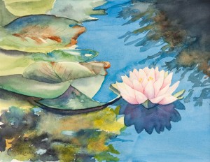
Water Lily, watercolor painting by Norm Rossignol

I am delighted to have finished a website for Norm Rossignol at www.normrossignolart.com! I was already acquainted with Norm as he had a listing on www.soartists.com, the site I created to promote the art community of southern Oregon, and am happy to know him much better after meeting with him and working on his website. It’s amazing how much this endeavor can show you about a person – some clients have even said they learned much they didn’t know about themselves through the process!

Norm is a plein air painter, which means he paints outdoors, on location. He is very supportive of his fellow plein air artists, to the point that he co-founded the Plein Air Society of Southern Oregon (or PASSO) to enourage and coordinate regular paintings sessions “en plein air” with both new and experienced artists. His watercolors are beautiful, and he has taught watercolor painting at ScrappyCraft in Phoenix, Oregon for the past three years. He’s now taking a break from teaching and watercolors to renew his focus on another love – pastels – and they are just stunning! He is also a member of the Watercolor Society of Oregon and The Pastel Society of Oregon, and the Southern Oregon Society of Artists, as well as additional plein air-focused groups.

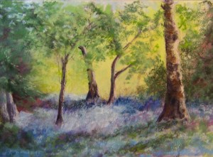
Bluebell Woods, pastel painting by Norm Rossignol

Norm is a kind, energetic and engaging man. I can see why his classes were popular! His wife is an avid horsewoman and he enjoys videotaping her weekly riding lessons on Gabriel, her handsome Haflinger. He’s not timid when it comes to trying new things, something I learned when he dived in almost immediately to create his first post his his brand new blog! I hope everyone in the SO art community and all who love plein air painting and landscapes will follow his blog as it promises to be entertaining and informative, not to mention lovely, as I’m sure he will illustrate his posts with images of his work.

Norm was kind enough to write this recommendation for me, which I just received this morning:

Wanting my very own web site seemed so daunting to me that I put it off for years. I envied those who had a site and maintained it on their own. Then there’s the need to ensure your images are protected properly from being copied.

Hannah West has been managing SOAR for some time now and I have seen that site do wonderful things for artists. One of the things that stood out from Hannah’s work is “She has your back.” Not only builds a beautiful site but all your work is safe. Another feature I needed was a Point and Shoot style operation and Hannah has a designed system that is just that easy. Most webmasters can build a web site that is just fine, but a web site made especially for artists is another matter. Hannah being an artist herself has that insight needed to develop a tasteful and easy site to display and use. I am most grateful to Hannah for her hard work and dedication to developing my site.

Easy operation
Attractive presentation
Custom built for your needs
Easy maintenance
Safe from piracy
Something to be proud of
What more could you want?

Sincerely Norm Rossignol
Normrossignolart.com