new website announcement

New Website for Veronica Thomas

Veronica was introduced to me by Boni de Laire, whose website I reconstructed in June 2014 and have maintained since then. Originally from South Africa, Veronica has lived in the States for the past 15 years. Since moving to Oregon she has been realizing her dream of becoming an artist, focusing on oil painting. When the opportunity to attend an exclusive painting workshop in Scottsdale, Arizona, arose, Veronica started looking for ways to earn some extra money to cover her travel expenses, and friends agreed to host an art salon at their home in mid-April. Mentor Boni insisted that a new website for Veronica Thomas was a must at this critical juncture, and that it be completed by the time the art salon took place so she would have an online promotional tool to work with. That’s where I entered the picture.


When the three of us sat down to discuss the project, I showed them the last site I had completed, www.michaelcarpenterart.com. Veronica liked it so much she went straight for a similar design using the same theme, Divi, by Elegant Themes. As with all my other clients, Veronica’s site was equipped with a full suite of plugins for search engine optimization, page loading speed, social sharing, and of course security to protect the website and its visitors.


One of the fun things we incorporated was a Google font with a special effect, accomplished with a css styling trick. Veronica wanted the headings to match the branding on the invitation mailers, flyers, and business cards that her daughter Chloe had developed for her. It wasn’t available as a Google font, but they wree able to find one that was so similar one can hardly tell it’s not the same. The other challenge was that Veronica wanted the header with the effect on the home page, but without the effect on all the other pages. Not only was I able to pull this off successfully, but the research and the execution went very quickly, so it wasn’t a spendy experiment either. I love how my clients push me to learn new things with their challenges! Another arrow in my quiver…


The one sticky part of the Divi theme seems to be the banner space. It’s a bit unpredictable how much of an image will appear in this space in a desktop browser, yet the entire image will show in a mobile browser.  I can do quite a bit of customizing, but it’s still tricky. Chloe is proficient with image editing and social media, so she was a huge help in this regard. In the end, our collaboration again resulted in a new website for Veronica Thomas in which we all take a considerable amount of pride. It was completed and launched well before her deadline, Veronica sold enough paintings at her art salon to help cover her expenses during the workshop in Scottsdale, and she is now busily absorbing all the new information she possibly can in Arizona! We will be doing the first update on her site once she returns to indicate which paintings have been sold. Meanwhile, here are screenshots of Veronica’s new website as launched on April 17, 2015. You can click these to view larger versions, and there is a link to the live website in the paragraph below.
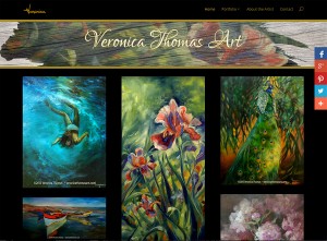
 

veronicathomasart.com, new website for artist Veronica Thomas created and launched in April 2015 by Hannah West using a customized version of the Divi theme.
Website created for artist Veronica Thomas in April 2015 by Hannah West.
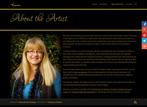
Screenshot of Veronica's Bio page, showing the difference in the heading style from the Home page
Screenshot of Veronica’s Bio page, showing the difference in the heading style


Please visit Veronica’s website and help it gain momentum with viewers online and the search engines. Her artwork is beautiful and, from children to wildlife and still life to plein air landscapes, she paints such a wide variety of subjects that it took eight portfolio categories to accommodate them all! Her site is another beautiful example of how the Divi theme can be customized for various purposes. If you would like to see examples of how I have used and customized Divi in other projects, click the links in the sidebar for fashion jewelry designer www.wendygell.com (including e-commerce shop), portfolio galleries of landscapes in oil at www.michaelcarpenterart.com, soft and lovely watercolor portfolios at www.judybuswell.com, presentations for harp strings and related products and information at markwoodstrings.com and the spectacular Mountain Glen Harps website, with one of the most amazing home pages I’ve made to date. This last one is a great way to see what’s possible with Divi.


If you like Divi’s flexibililty but would like to see an alternative, I have used a similar, and very popular, premium theme called Avada which I purchased at Theme Forest to create www.jacksonvillechiropracticclinic.com (very professional and takes advantage of numerous shortcodes in the design), and the gorgeous nonprofit ecommerce site www.missioncandles.com, probably the most beautiful site I’ve created yet. I enjoy working with both of these themes and though there are many themes out there I’d love to play with, I do hope to use the truly premium quality Avada again in the near future.


Friends take care of friends and extend the family. I’m so happy to have gotten to know Veronica and look forward to an ever-deepening friendship with her. Many grateful thanks to my dear friend and talented artist Boni dé Laire for referring Veronica to me! Please visit Boni’s website to see her amazing landscapes in oil. You will not be disappointed, they are truly spectacular and we will be adding a new painting soon!


MissionCandles.com Online Shop is Open!

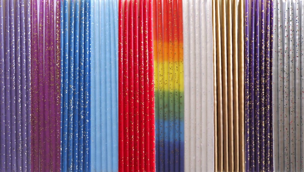
Rainbow Cheerlites® candles are a Mission Candles exclusive!

Just in time for the holidays, we have finalized the shopping cart and the missioncandles.com Online Shop is open and ready for your holiday candle orders!

Many heartfelt thanks to Laura O’Bryon, Executive Director of Community Works, the nonprofit parent organization of Mission Candles and the Lithia Springs Program of which Mission Candles is a part, Jim Posey, Director of Education and Residential Treatment Services, and Jason Fauble, the Mission Candles Production Coordinator, for entrusting me with the renewal of the Mission Candles website and online shop.

I can’t say enough about how much I believe in this program. The testimonials of youth who have graduated the program tell the story of how effective it is at helping Ashland, Oregon youth who have experienced debilitating problems of one kind or another and educating them, providing work experience and other essential services, teaching appropriate and effective relationship skills, and turning out young men and women who are ready to become valuable members of the community. The Mission Candles component of the program is financially self-sustaining and a crucial part of the healing, empowering experience that the Lithia Springs Program provides.

I am equally excited about the candles that Mission Candles produces! They make 9″ tapers in a variety of colors to match just about any décor scheme and an exclusive rainbow taper for a lively look. Perfect for candelabra, menorah, wall sconces, candlesticks, and more. Gorgeous. Then there are the Cheerlites®. These “birthday” candles take the cake! These come in 3″ and 8″ lengths (have you ever heard of 8″ cake candles? Their existence was news to me…), in a wide variety of colors to suit any occasion (including Mission Candles’ exclusive rainbow, and metallic gold and silver!), and can be used for holiday centerpieces and other décor applications beyond the kitchen. Not only do they come in a dizzying array of beautiful colors, but you can also opt for one of four different glitter finishes (something I had not seen before and fell in love with) – multicolor glitter, gold or silver glitter, and opal glitter – a subtle and beautiful accent that adds extra sparkle to the table and the eyes of those around it. I am enticed by the thought of delicately sky blue candles with opal glitter to send our daughters for their sons and grandsons’ birthdays, red candles with gold glitter for my mom, elegant metallic gold candles for decorating, and who can live without the royal touch of purple somewhere in their home? The prices are reasonable for such lovely and versatile options, and to celebrate their website’s launch they are offering FREE SHIPPING from now through January 1! I’ll be ordering some myself, and you should too!

Please visit missioncandles.com today and support this important social program with a purchase of candles…for birthdays, holiday decorating, gifts and stocking stuffers. Your friends and family will love them, and you will want them in your own home all year ’round!

MissionCandles.com Online Shop is Open!


Web Design Client Updates for January 2014

I wanted to let people know about my Web Design Client Updates and additional news for January 2014.  I’ve been busy and it looks like I’ll be getting busier as word continues to spread about my web design skills and work ethic.

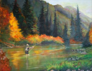
Fly Fishing, painting by new web design client, artist Joan Pechanec
Fly Fishing, painting by Joan Pechanec ~ Click to see more on Joan’s new website!

New Web Design Client, Artist Joan Pechanec

First, it’s lovely to announce the completion of a new artist website for Joan Pechanec of Mt Shasta, California. The website is built on the WordPress platform, using the Emphaino theme with lots of custom modifications so the resulting site design would suit her aesthetics. She had a budget and a target completion date in mind, and we finished under budget and on time. She has art works in two categories on her site – assemblage/collage pieces and more recent oil paintings. As she and her husband, author Charlie Price, were on their way out of town for a 3 month writer’s residency at Fairhope on the Gulf Coast of Alabama, it was perfect that they were both able to come up and meet me in person before they left. Working with Joan by remote (a good bit of it while they were on the road to their destination) went smoothly and I’m delighted that both she and her husband are pleased with the results!

Joan wanted visitors to her website to be able to see all the works on her home page, so we chose a theme that’s designed with the masonry technique (like Pinterest), yet with a dark background that really makes the saturated colors in her paintings pop. The masonry style image blocks on the home page are each linked to a post with more details about the painting. Since she will be away for a while, we decided to post the paintings with just the most essential details for now. It was a joy working with Joan’s art! We’ll add text and artist’s comments when she returns home, along with the new paintings she is creating while on the Gulf Coast. I hope you will visit joanpechanec.com and have a look!

Website Update for Artist Christina Madden

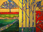
Web Design Client Update: Adding 'Nature's Views,' mixed media painting by Christina Madden, to www.christinamadden.com
Nature’s Views, mixed media painting by Christina Madden
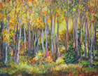
Web Design Client Update: 'Adding Autumn at the Green Springs,' oil painting by Christina Madden, to www.christinamadden.com
Autumn at the Green Springs, oil painting by Christina Madden


Artist Christina Madden has been painting away since I last wrote, and these two pieces are among my favorites of the new works we have recently updated her website with. The two seem to bookend the range of her style; both are landscapes, but one is a bright and colorful mixed media painting in a more abstract style, the other an oil painting in an impressionist style, with colors a bit more subdued than we usually see from her hand. Christina is working hard to create a style that’s all her own, and it appears to me that she’s succeeding. She’s very excited because she will be going to ArtExpo in New York City this year! It’s been wonderful to watch her style grow and change since we began working together, and I know she will be successful at this prestigious New York show.

Bill Stanton’s Art Exhibit at the GoodBean Cafe

Landscape, by Bill Stanton, on display at the Goodbean Cafe in Jacksonville, Oregon until January 31, 2014
Landscape, 4′ x 4′ oil on canvas by Bill Stanton

I’m sure I must have mentioned that among the things I do to have some regular in-person facetime with artists and their work is curating and managing the art exhibits at the GoodBean Cafe in my hometown of Jacksonville, Oregon. December was a group show with the theme of “Angels,” which drew great enthusiasm from the shop’s clientele, so much so that the owner decided she wants to do the same theme every December from now on! This month we’re featuring artist Bill Stanton, whose landscapes painted in deep impasto oils are in high demand in the area. Bill isn’t entirely reclusive, but he doesn’t do a lot of shows or promotion…it’s mostly locals who are in the know who support his work…so we’re fortunate to have him. We would love it if you could come in and see them for yourself – we just renovated the back wall to make more room for the art, and his large (some huge) paintings look terrific in the space! If you’re not in the area, take a look at this post about the show to learn more.

Web Design Projects in Development and Coming Soon

That’s all I have completed and ready for you to view right now…though I’m working on a bunch of other projects that will be ready soon:

  • Helping Stefan Baumann complete his artist website

    • Stefan started on his own, but became too busy to finish the project himself. In addition to a grueling art instruction schedul which involves a lot of travel, he’s painting like crazy to prepare for a big southern California show in September. Want to watch as Baumann’s website develops? Visit www.stefanbaumann.com
  • New concert posters, video editing and website updates for Christina Duane’s Romancing the West 2014 tour.

  • Redesigning the website for Community Works

    • Community Works is the parent organization for the highly respected Dunn House in Medford, Oregon, which helps women, youth and families impacted by domestic abuse and sexual violence. I am delighted to be working with Development Director Misha Levee Hernandez on this project. (Need help yourself? Visit their current website here. )
  • Updating artist Pegi Smith‘s existing website with new paintings.

    • As with Christina Madden, I did not design Pegi’s site, but her previous webmistress is stepping aside from website work and Pegi brought her maintenance work to me just yesterday! I can’t wait to work with her beautiful paintings! pegismith.com

In addition, I’m beside myself with glee that I’ve gotten two new web design projects to begin soon. One is an artist website. Just yesterday I went to visit this artist’s studio and nearly wept at the beautiful work I saw there! We should be getting underway soon. The other is a WordPress based wine club website. I will hear for sure on that one Friday, and we should be getting started around the 27th if it’s confirmed tomorrow that it’s a go.

I hope you’ll check back again to see my very erratic updates on how things are going with these web design and site maintenance projects, and more!